
Agents are the new apps
Design System
As the founding design engineer, I owned the web platform and maintained our multi-theme design system and internal component documentation tool.
Here’s an example of the button component in different themes.
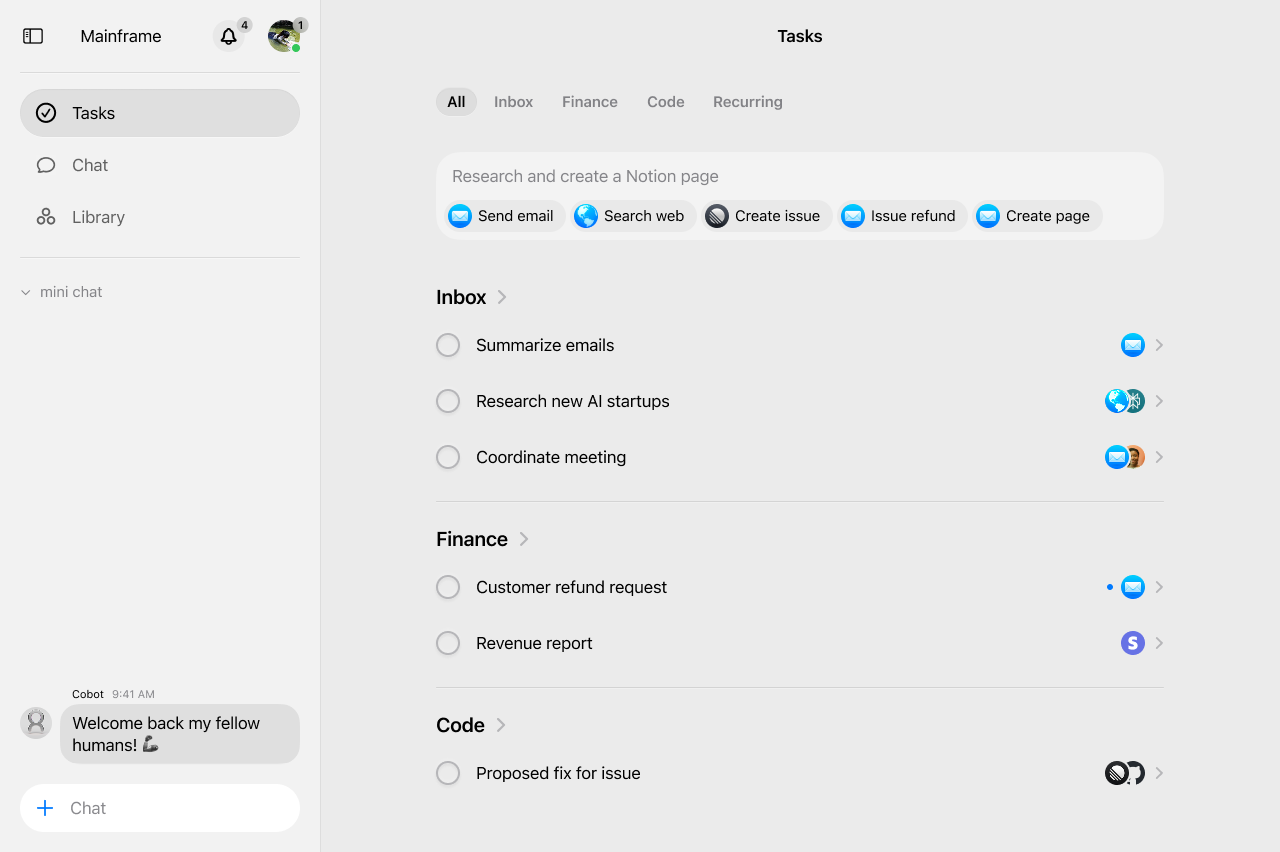
The Cobot Feed
Redesigning the home page from task lists to feed posts
Previously, users were managing their work through a standard checklist task interface. What we imagine next for Cobot is more a living feed of conversations, collaboration, and ongoing work. Tasks shouldn’t just be isolated to-dos, but starting points for conversations, collaboration, and ongoing work with Cobots.
Rethinking the architecture
The first big decision was moving away from thinking about this as a “task list” entirely.
This architectural change required using Next.js parallel routes.
app/[username]/home/
├── layout.tsx
├── @feed/ # Feed slot (left panel)
│ ├── default.tsx
│ └── page.tsx # Main feed content
└── @details/ # Details slot (right panel)
├── default.tsx
├── [taskId]/ # Dynamic task details
│ └── page.tsx # Task detail view
└── (.)[taskId]/
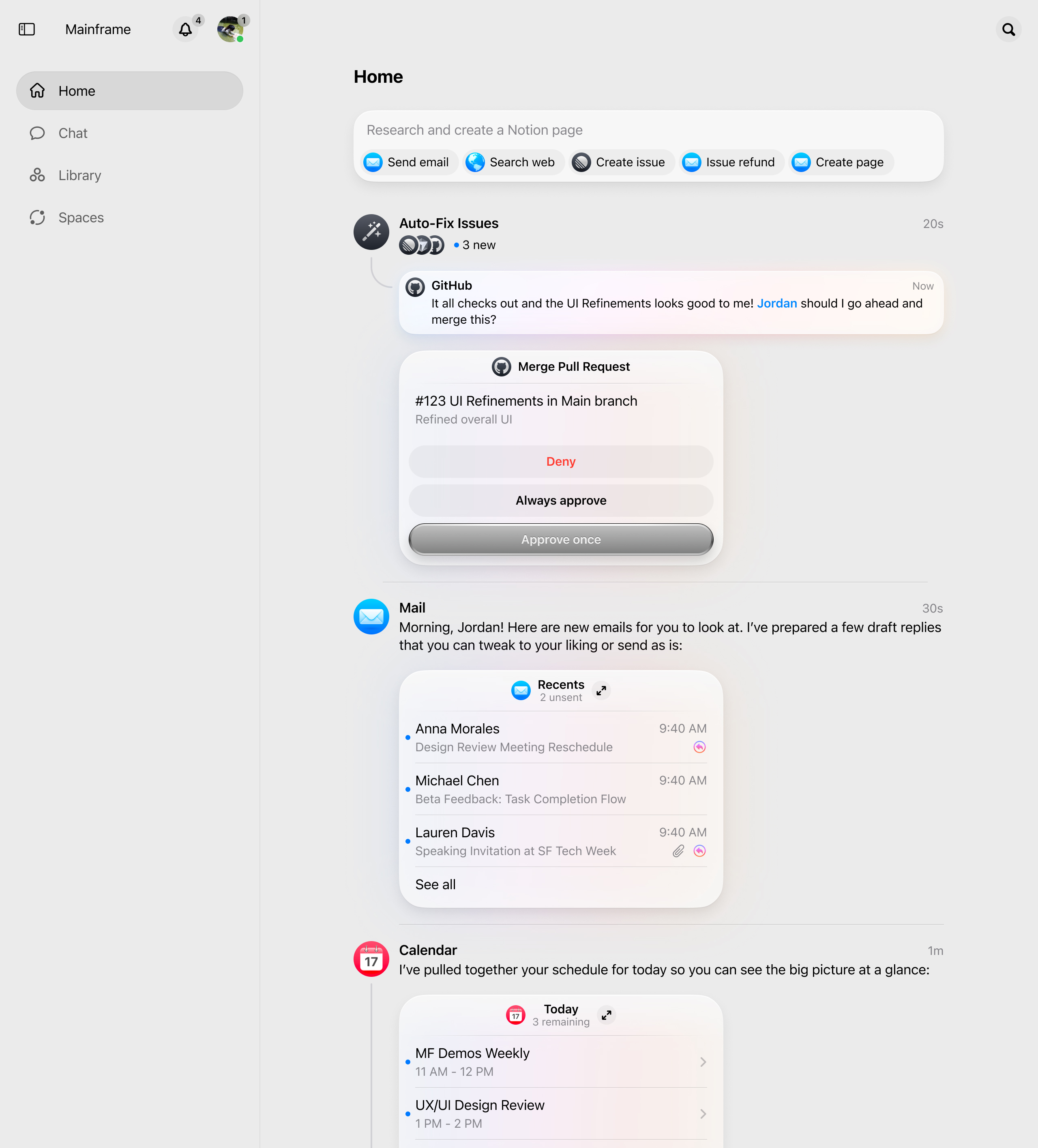
└── page.tsx Not every post in the feed is created the same way. Some may be manually created by users, others were generated by automated workflows, and some would be system initiated by Cobots.
if (task.workflowId) {
  author = {
    id: user._id,
    name: workflow?.name || "Workflow",
    type: "user",
  };
} else {
  // Regular tasks: look at who actually started the conversation
  const firstMessage = firstMessageMap.get(task._id);
  // ... determine the real author
}
The frontend visual challenge
A big part this feature included visual changes from a checklist interface to a feed interface. This included showing conversations that were happening around a task, in a thread-like format, as well as a curved line to indicate the relationship between a post and its conversation thread.
const updateLineHeight = () => {
  if (contentRef.current) {
    const contentHeight = contentRef.current.offsetHeight;
    const curveIconHeight = curveIconSize * (43 / 27);

    if (contentHeight < minContentHeightForLine) {
      setLineHeight(0);
      return;
    }

    const calculatedHeight = Math.max(
      contentHeight + 16 - curveIconHeight - curveIconSpacing + 5,
      20
    );
    setLineHeight(calculatedHeight);
  }
};
I used ResizeObserver to watch for content changes and recalculate the line heights in real-time. If a post had longer content, the line would grow to match.
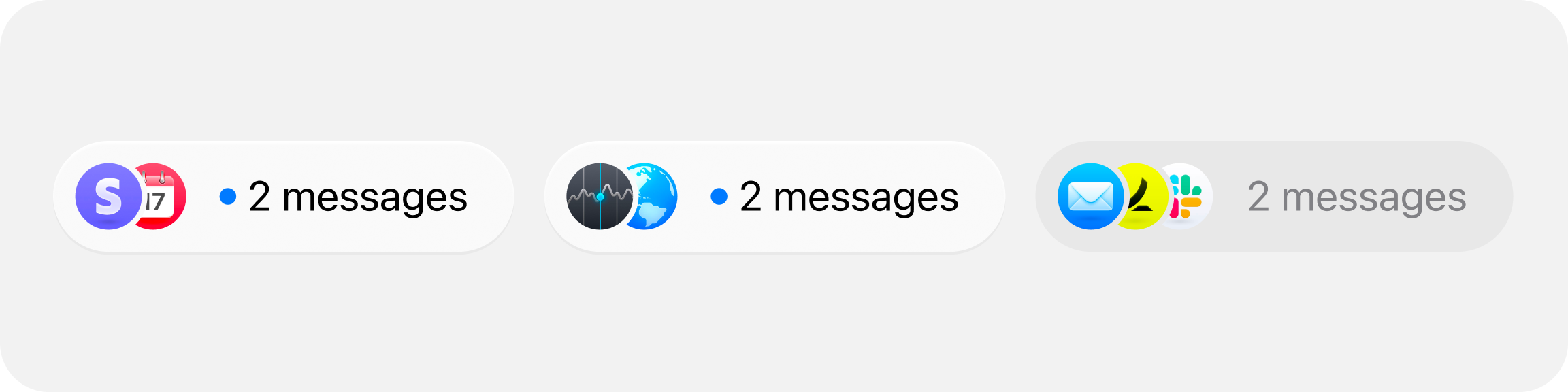
Task participants
Once I had the threads of each feed post, we needed to show who was participating in each conversation.
I ended up implementing this overlapping avatar design with CSS clip-path masking. The rightmost avatar shows fully, but each one to the left gets partially masked to create this stacked effect:
.avatar-masked {
  clip-path: path("M12.375 0C19.0023 0.000178326 24.375 5.37269...");
}
Showing a workflow in progress
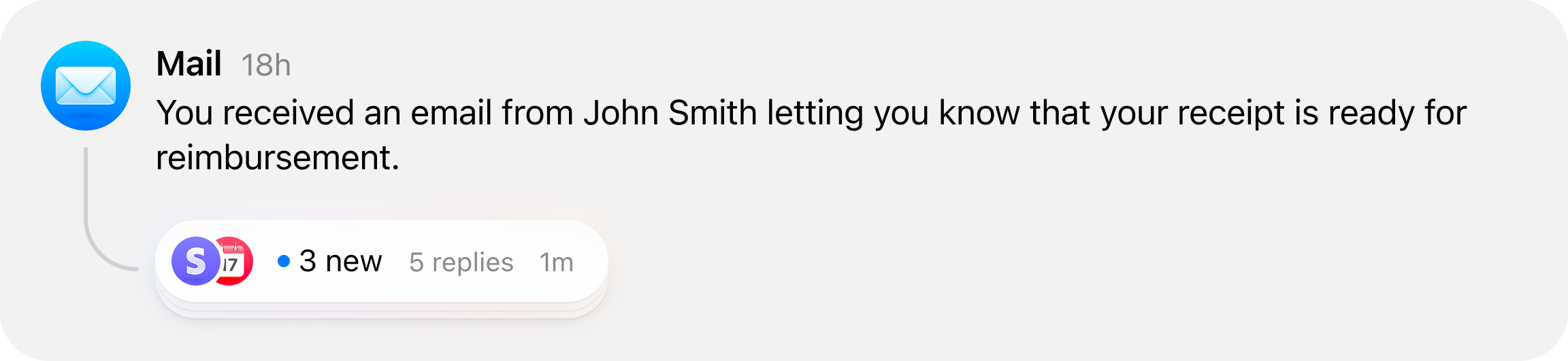
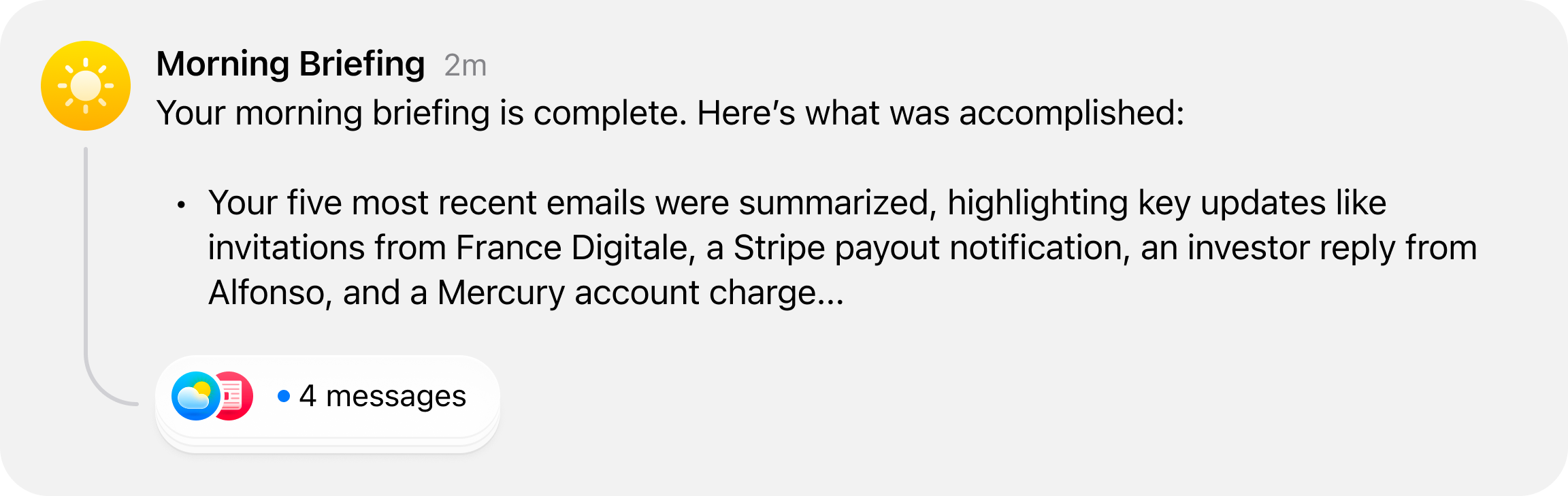
Workflow-generated posts needed to feel different from human-created tasks. Workflows in progress would generate long, detailed updates that would crowd the feed if displayed at full length.
I worked on creating a vertical marquee animation that showcases the latest message in a workflow, allowing users to quickly scan the feed and see what’s happening without having to read the entire message.
if (task.workflowId) {
  const workflow = workflowMap.get(task.workflowId);
  if (workflow && lastMessage) {
    // show the most recent Cobot message
    body = lastMessage.content || "";
  }
}
The message preview needed to have a visual distinction from the rest of the content, so I wrapped the content in a rounded & slightly elevated container.
<div
  className={cn(
    "flex flex-col max-w-full transition-all duration-300 ease-in-out",
    isWorkflowInProgress && "bg-fill-tertiary rounded-3xl p-3 px-4 mt-1",
  )}
>
The different states of a feed post
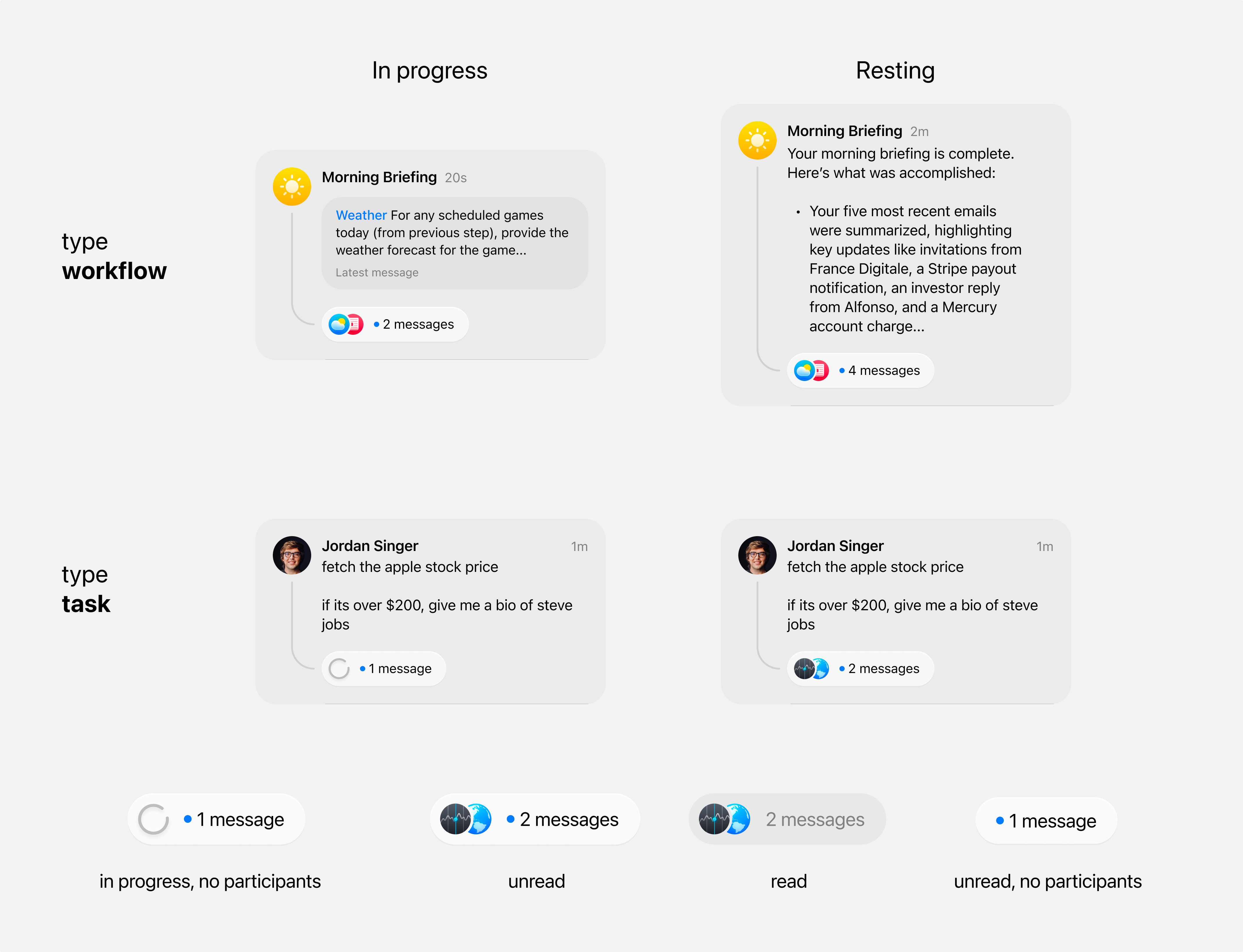
The core of the system is this state-aware rendering logic:
<TaskBodyText
  variant={task.inProgress ? `${task.type}-in-progress` : `${task.type}-finished`}
  content={
    task.type === "workflow" ? task.lastMessage?.content || task.body : task.body
  }
/>
The thread component also is accounted for to show different icon combinations based on conversation state.
<ThreadStack
  participants={task.conversation?.participants}
  currentUserId={currentUserId}
  isLoading={task.type === "task" && task.inProgress}
  isWorkflowInProgress={task.type === "workflow" && task.inProgress}
  unread={task.unread}
  totalReplies={task.messageCount}
  isCurrentlyViewing={isActiveTask}
/>
Monetization & Premium Theming
One of the most interesting product design challenges I worked on at Cobot was monetization. Specifically: how do you create a premium experience that users aspire to? And how do you let free users preview what upgrading could feel like without unlocking it permanently? The answer we landed on was an exclusive theme system — where the Pro tier isn’t just more features, it’s a different visual identity.
Designing the pricing experience
The pricing page needed to clearly communicate the value difference between Basic and Pro tiers without making the free experience feel lesser. I designed and built a comparison layout with two tier cards side by side — Basic at the lower price point with core Cobots (Calendar, Mail) and manual workflows, and Pro with unlimited access to all Cobots (Linear, Dropbox, Hubspot), scheduled recurring workflows, model selection, and custom Cobots via your own MCP Servers.
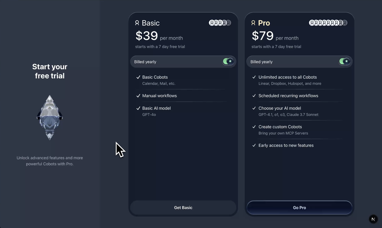
Each tier card includes a “Billed yearly” toggle that switches between monthly and annual pricing. The yearly toggle uses a pill-style switch that feels tactile — important for a decision that directly affects how much users pay.
Animated pricing strings
Building a theme-aware design system
The real engineering challenge was making the entire design system theme-aware. Every component — buttons, inputs, cards, sidebars — needed to adapt per theme, not just swap a few colors. I built the theming system using CSS custom properties scoped to a data-theme attribute on the root element.
The settings page includes a theme selector with multiple options (Desert Titanium, Glass, Diamond) and a light/dark mode toggle with a “Match system settings” option. Each theme defines its own full set of design tokens such as surface colors, text colors, border treatments, shadow styles, and accent colors.
Component-level theming
[data-theme="diamond"] {
  --color-surface-primary: #0f1729;
  --color-surface-secondary: #1a2332;
  --color-text-primary: #e8edf5;
  --color-accent: #4a9eff;
  --color-border: rgba(255, 255, 255, 0.08);
  --shadow-elevation-1: 0 1px 3px rgba(0, 0, 0, 0.4);
}

[data-theme="desert"] {
  --color-surface-primary: #f5f0e8;
  --color-surface-secondary: #ebe4d8;
  --color-text-primary: #2c2418;
  --color-accent: #c4956a;
  --color-border: rgba(0, 0, 0, 0.08);
}